Guided Tree Builder
Role: Lead Product Designer | Device: Mobile & Desktop Web | Time: 3 Months | 2022
ACHIEVEMENT
I was the lead designer who designed the end-to-end redesign of the Guided Tree Builder, from wireframes to high fidelity prototypes and animations. We launched it in separate tests and saw significant lifts in all key metrics. After going through the new flow, more users understand why they should build a family tree and what they could discover afterward. They are more motivated to finish and add more information to their trees.
TEST RESULTS
Confirmation page test showed statistically significant results on:
- Guided Tree Builder visit (Δ = +40%)
- Node Creation Rate (Δ = +6%)
GTB redesign showed statistically significant results on:
- Node Creation Rate (Δ = +15.7%)
- Node Creation Number (Δ = +44.0%)
Value prop showed statistically significant results on:
- Census Hints Generation Rate (Δ = +6.33%)
- Census Hints Acceptance Rate (Δ = +11.81%)
Intro modal test showed statistically significant results on:
- Completion rate (Δ = +6.23%)
- Start rate (Δ = +3.53%)
- Node creation rate (Δ = +6.94%)
- Hints generation rate (Δ = +5.15%)
We rolled out the design after testing positive and were able to iterate more tests on top of this new flow because of the flexibility and modular structure.
CONTEXT
Building a family tree is the first step of Ancestry's user engagement flywheel. The more Nodes (family members) customers add to their trees, the more Hints (records matching with family members' information) we can generate for them, and the more discoveries and engagement on our sites.
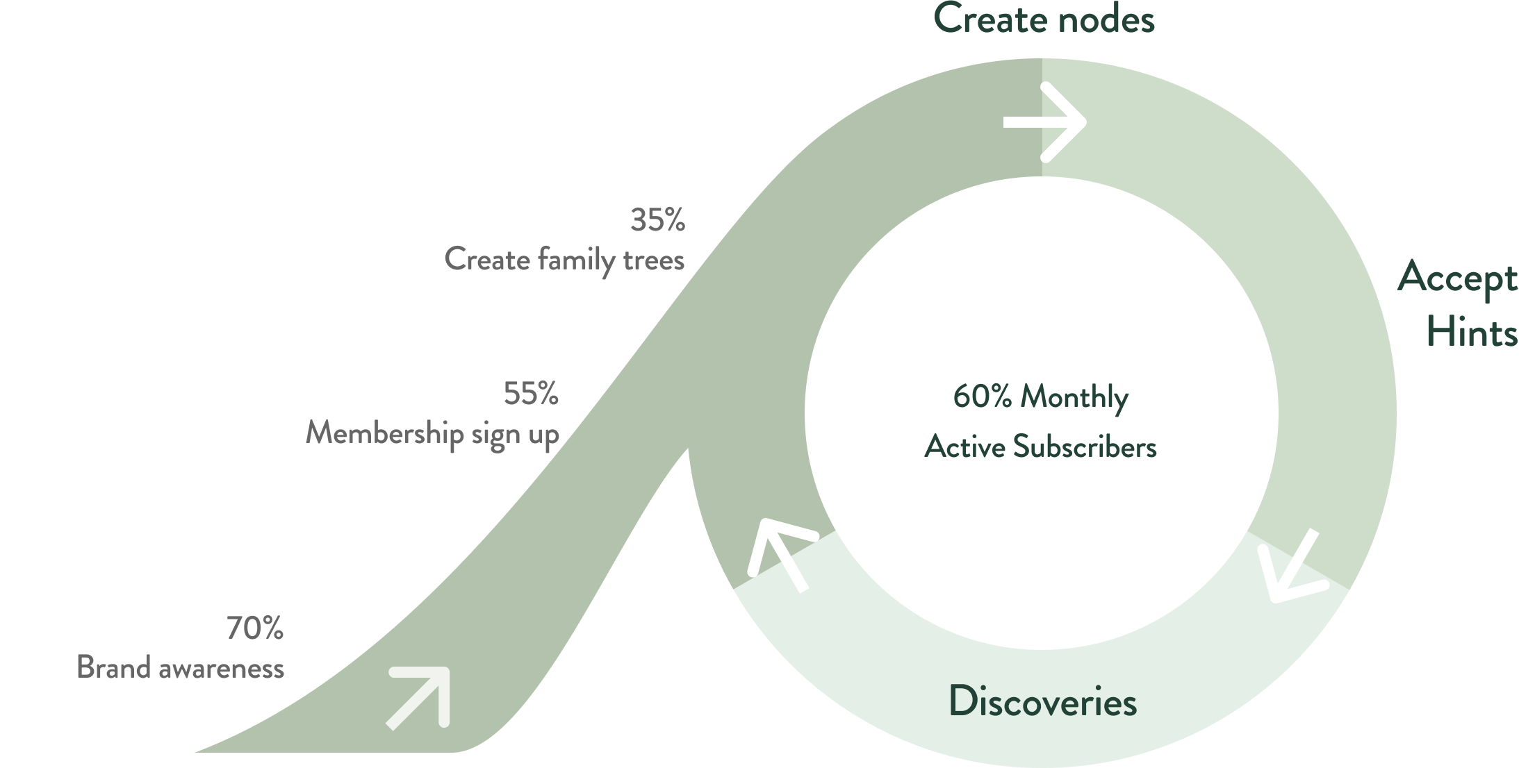
Pic. 1 Family History Product Onboarding Flywheels 2021
THE PROBLEM
Only 69.30% of users started family trees and created nodes after checkout. All the key metrics (bill through rate, active discovery rate, 3-day citation rate, etc.) were the lowest among users without a family tree or less than eight nodes. Users ended up canceling the memberships without experiencing the product's actual value.
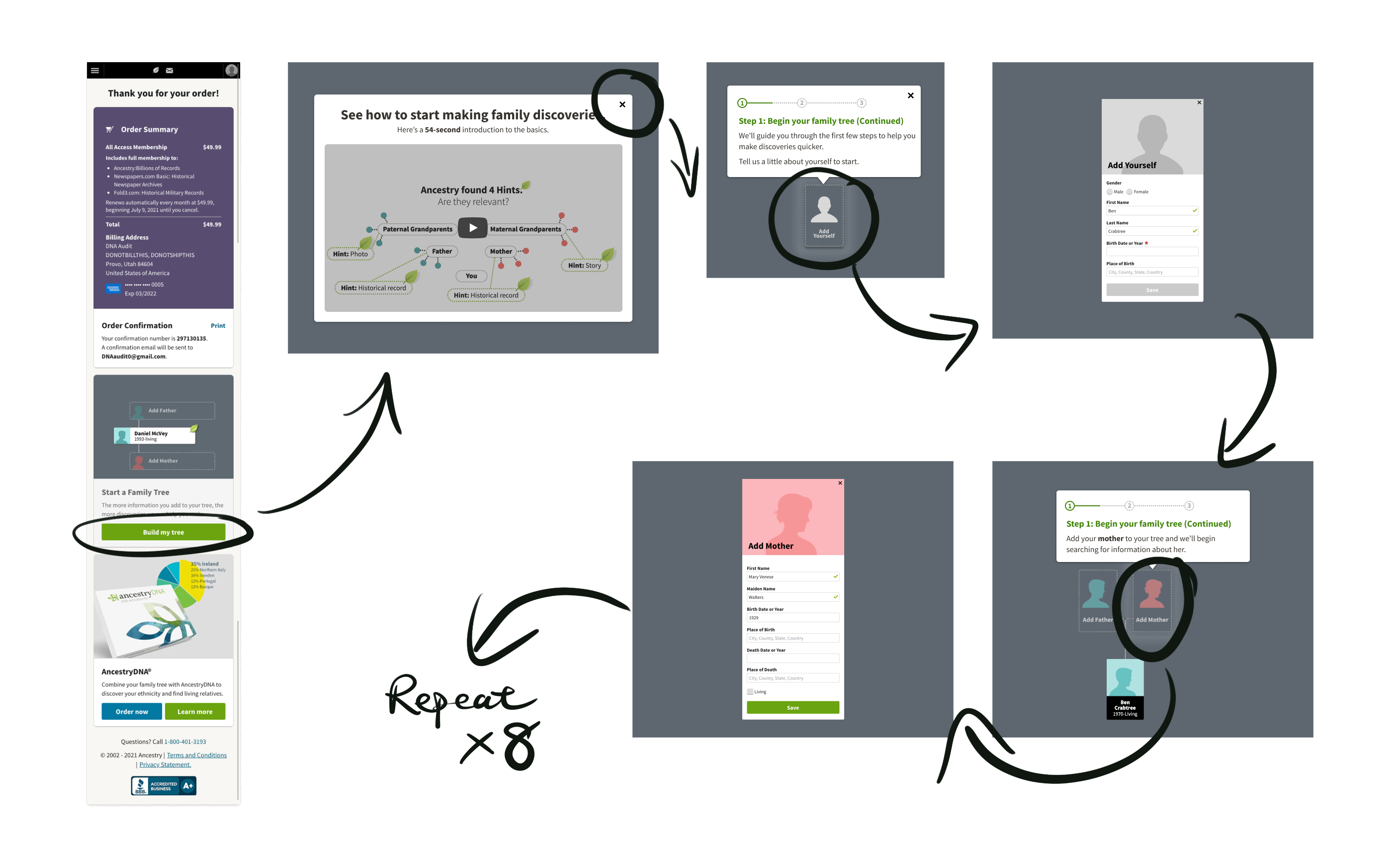
Pic. 2 Screenshots of the Guided Tree Builder in 2021
THE SOLUTION
By priming users with the value of building a family tree up front, reducing the friction of adding family members and their information, and bringing delight and encouragement in between adding nodes, users will be more likely to start family trees and add more nodes.
We run the following tests to improve the key metrics and user experience:
- Reducing the friction of starting a family tree.
- Demonstrating the value of starting a family tree up front.
- Redesigning the Guided Tree Builder with a sequential structure.
- Incorporating animations to the family trees to show progress, spark delight, and boost the sense of achievement.
- Priming users with records and discoveries they could get in between adding nodes to encourage them to add more nodes.
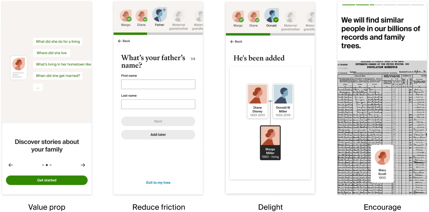
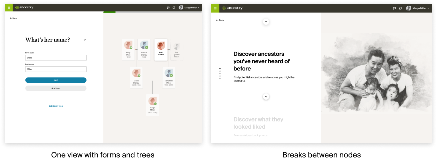
Pic. 3 Selected screens of the guided tree builder redesign
USERS
Our product strategy focuses on our Casual Customers, the group most critical to our growth. They are more likely to subscribe to our memberships when they experience the product's value. Our UX research team clustered three segments of users: Curious, Casual, and Core. After understanding their behavior and backgrounds, I devised the ocean analogy to profile these three user groups.

Pic. 4 Curious, Casual, Core user profiles. Photos by @jakobowens @khandro @sebaspenalambarri on Unsplash
Our Casual Customers are diverse in both in age and in ethnicity. Like Core, very interested in learning about ancestors and what their lives were like, but struggles with the existing experience. Family history competes with other things in their busy lives. May seem time consuming and expensive, so may dip in and out over their tenure.
It is essential to guide this group of users to make discoveries. Time-to-discovery is very crucial to the success of their experience. Reducing friction and generating discoveries for them is critical.
"I came to Ancestry to uncover mysteries, unknowns, even bombshells. I am open to anything that I might find or might arise out of this exploration."
"I have always felt incomplete and uncertain about who I am. I feel driven to uncover and understand things that have always felt unknown and difficult to know."
"Time is very important to me and I don't want to waste my time. I realize I have only just begun and that this is quite time consuming if you want to do it right."
DESIGN
The redesign was an end-to-end flow composed of 4 different components A/B-tested separately: order confirmation, intro modal, questionnaire tree builder, and value prop. The questionnaire tree builder is the main flow with questions about family members' information. The value prop is eye candy and motivations that are inserted in between questions to encourage users to complete the tree building.
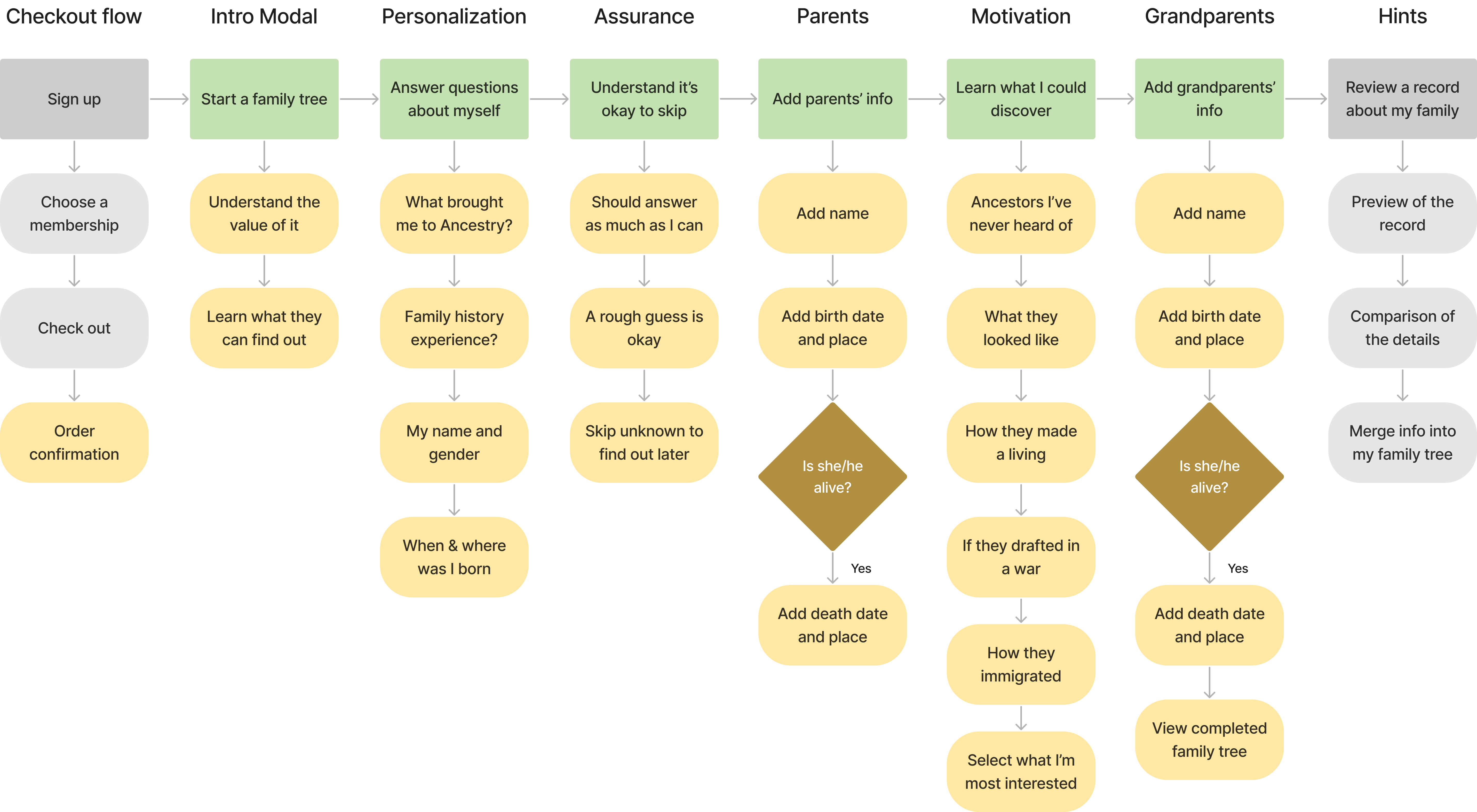
Pic. 5 Flow chart of the end-to-end experience
01 Order confirmation
Only 25% of customers clicked start tree CTA on the order confirmation page. Even though they could access GTB on homepage, we were losing the best entry point to start a tree. By getting rid of the order confirmation page and only showing a toast notification for confirmation, we can get users to start product experience without efforts.
Confirmation page test showed statistically significant results on Guided Tree Builder visit (Δ = +40%) and Node Creation Rate (Δ = +6%)
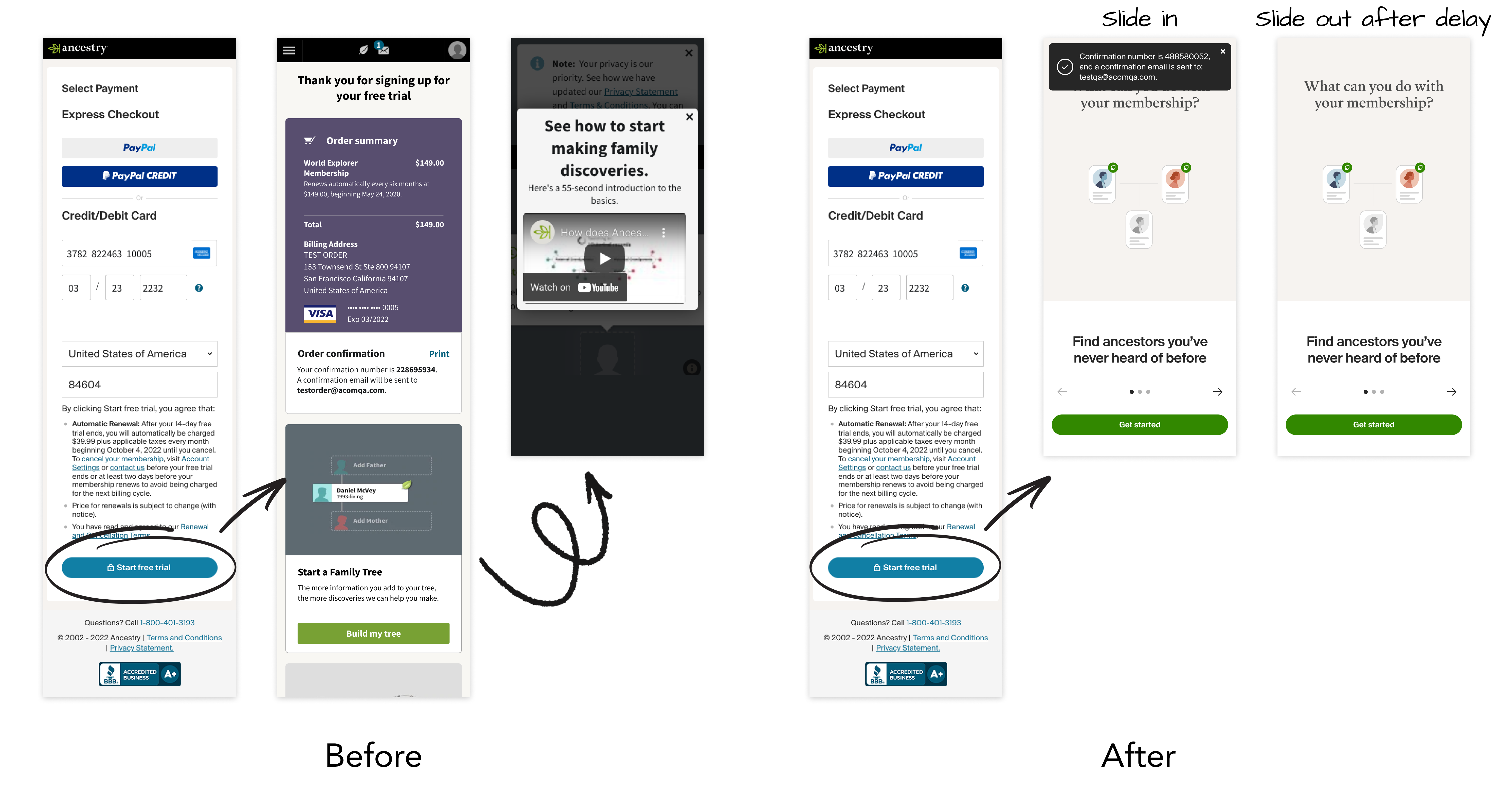
Pic. 5 Order confirmation page before vs after
02 Intro Modal
Only 37% of customers watched the intro video on the importance of starting a family tree. Those who watched had a higher bill-through rate after the trial period. Creating animations in a carousel allows us to provide critical information without watching a one-minute video.
Intro modal test showed statistically significant results on completion rate (Δ = +6.23%), start rate (Δ = +3.53%), node creation rate (Δ = +6.94%), and hints generation rate (Δ = +5.15%)
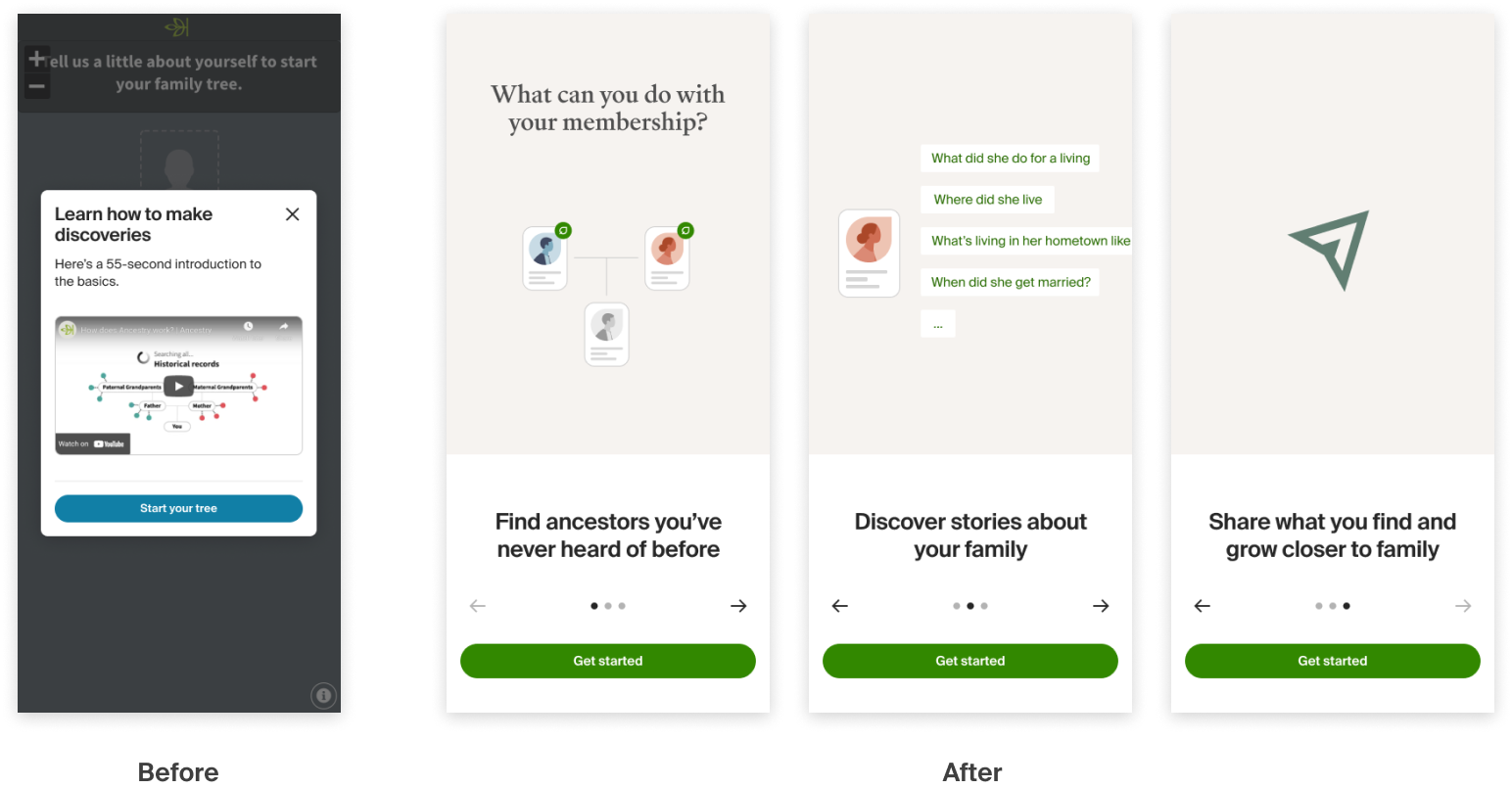
Pic. 6 Educational video vs intro modal with animations
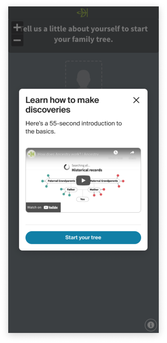
Pic. 6.1 Previous eucational video
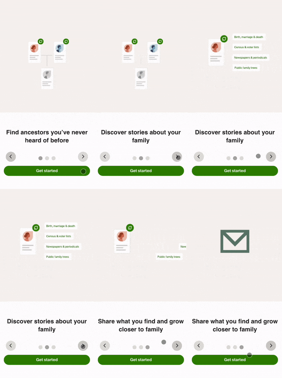
Pic. 6.2 Intro modal with animations
Building Family Trees
The previous Guided Tree Builder asked users to add people into the tree in a linear flow but required clicking on the tree nodes and filling forms in different views. Structuring the flow in a single view and removing clicking in and out of the tree view reduces friction. It also avoids cognitive overload and increases the completion rate by asking one question simultaneously.
GTB redesign showed statistically significant results on node creation rate (Δ = +15.7%), node creation number (Δ = +44.0%).
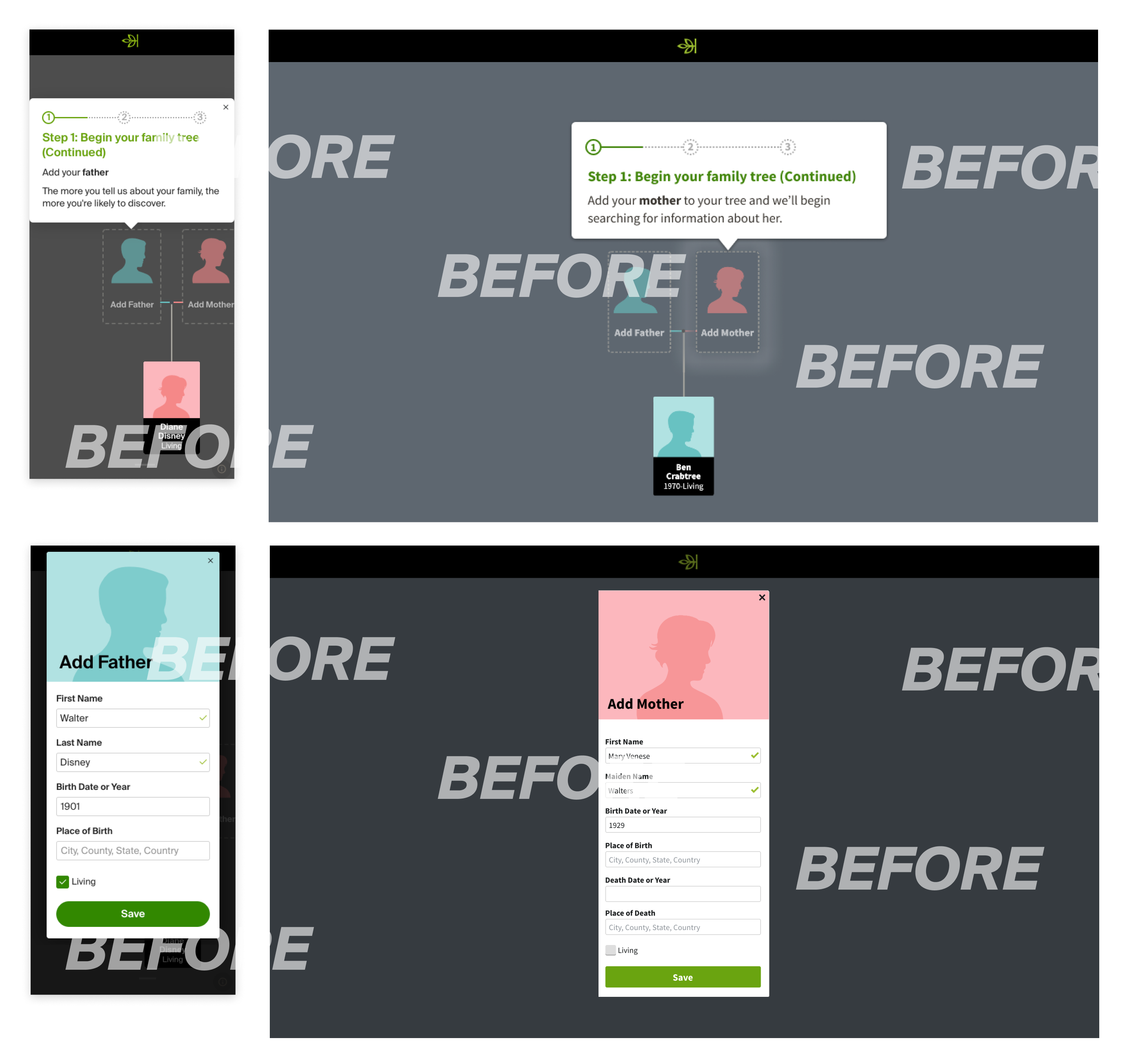
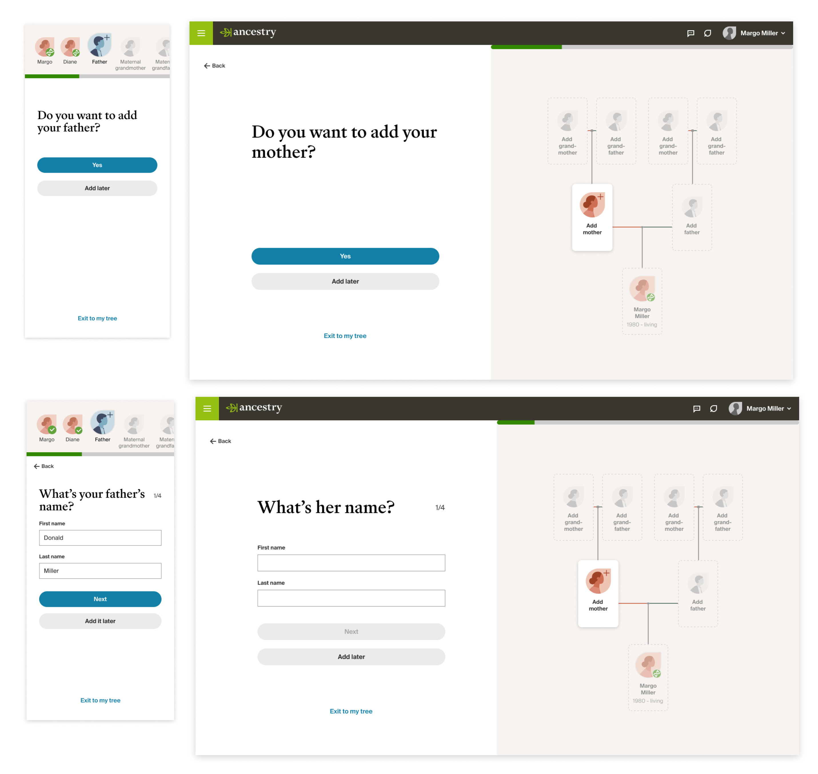
Pic. 8 Previous vs Redesign of Guided Tree Builder
Value Prop
From user research, we learned that over half of the users were unclear about what to expect once they finished building a family tree. They lacked the motivation to add all the family members they knew to their trees. Through effective messaging, we could ease the mental burden of going through our tree-building flow.
Value prop showed statistically significant results on Census Hints Generation Rate (Δ = +6.33%), Census Hints Acceptance Rate (Δ = +11.81%).
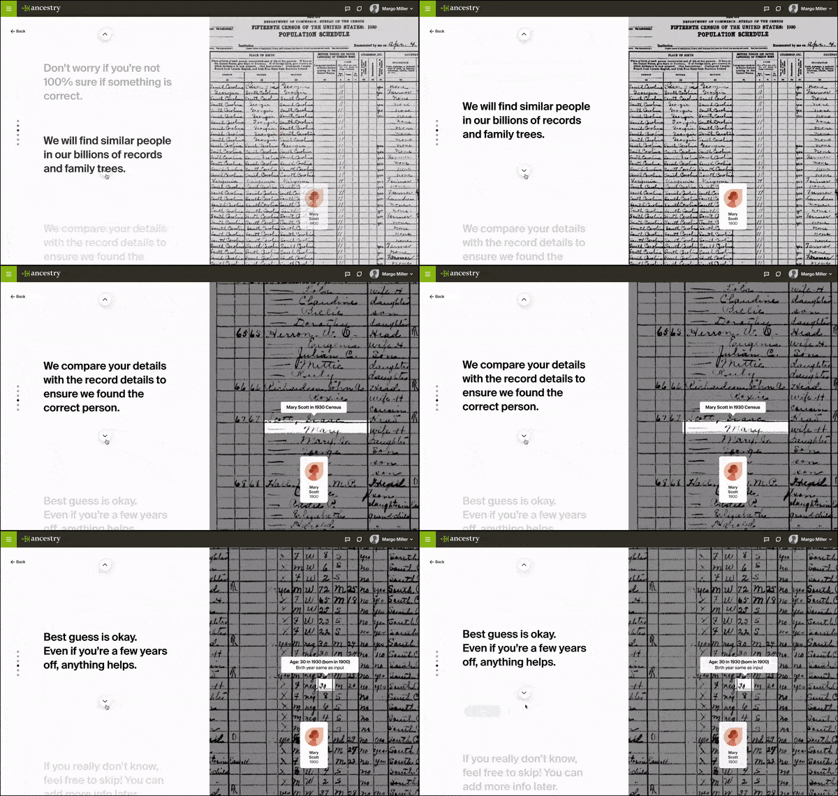
Pic. 9 Value prop before adding parents
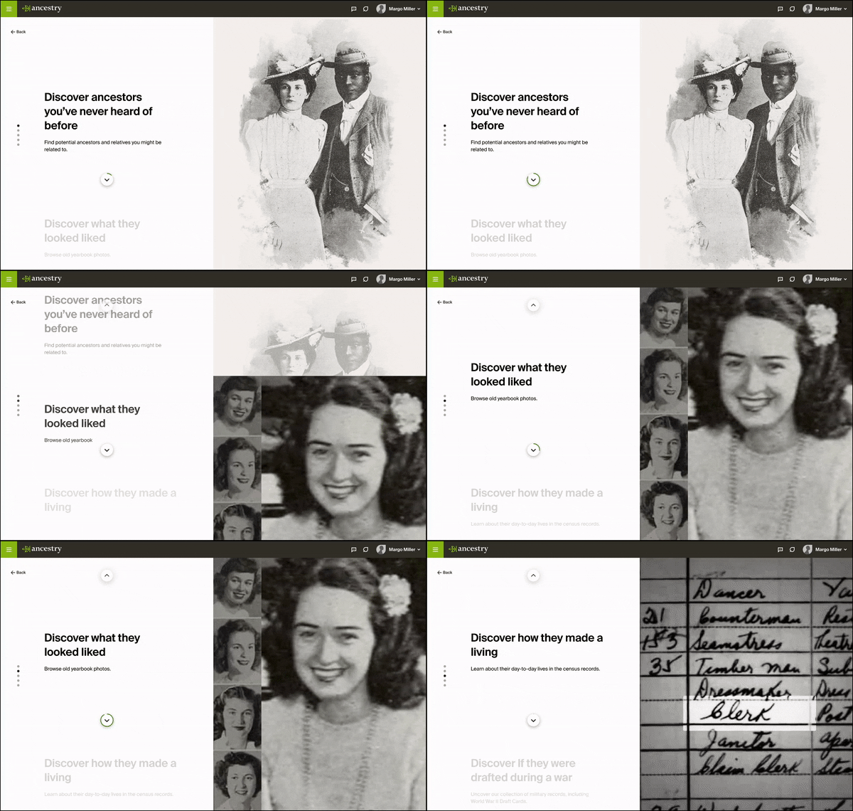
Pic. 10 Value prop before adding grandparents
REFLECTION
The redesign of the Guided Tree Builder is not only a refresh of the feature itself, but a re-construction of the tree building flow with less friction and a better context setting. After going through the new flow, more users understand why they should build a family tree and what they could discover afterward. They are more motivated to finish and input more information. As a result, we saw significant lifts in all key metrics.
Since I joined the team, there have been a lot of organizational changes. I worked with three different PMs, and two dev leads within one year who owned the Guided Tree Builder separately for a few months. It was challenging to build and test a flow as long and complex as this. But it was so great to ship out the redesign finally and see it perform well in several A/B tests for different sections in the flow.
There are some other parts of the flow that I didn't include in the case study. Some tests failed or affected other metrics, but we still learned from them and iterated for new tests.